Page 1 of 1
198 January Comp 2018
Posted: Tue Jan 09, 2018 9:21 pm
by stopher002
Evening Guys & Gals
Sorry for the delay, work got in the way.
I've been racking my head to come up with an idea
Comp is as this:
I'd like to see a image out of camera, then the same image edited for competition. (side by side)
Its to see where you started and your thoughts of were it would go (your style or where the image took you)
So you can show others your creative side from start to finish. We always see the finish version, lets see were you started first.
Any subject, fill your boots.
An example of mine
Comp to finish 20th Jan
Re: 198 January Comp 2018
Posted: Wed Jan 10, 2018 8:53 pm
by Tracey McGovern
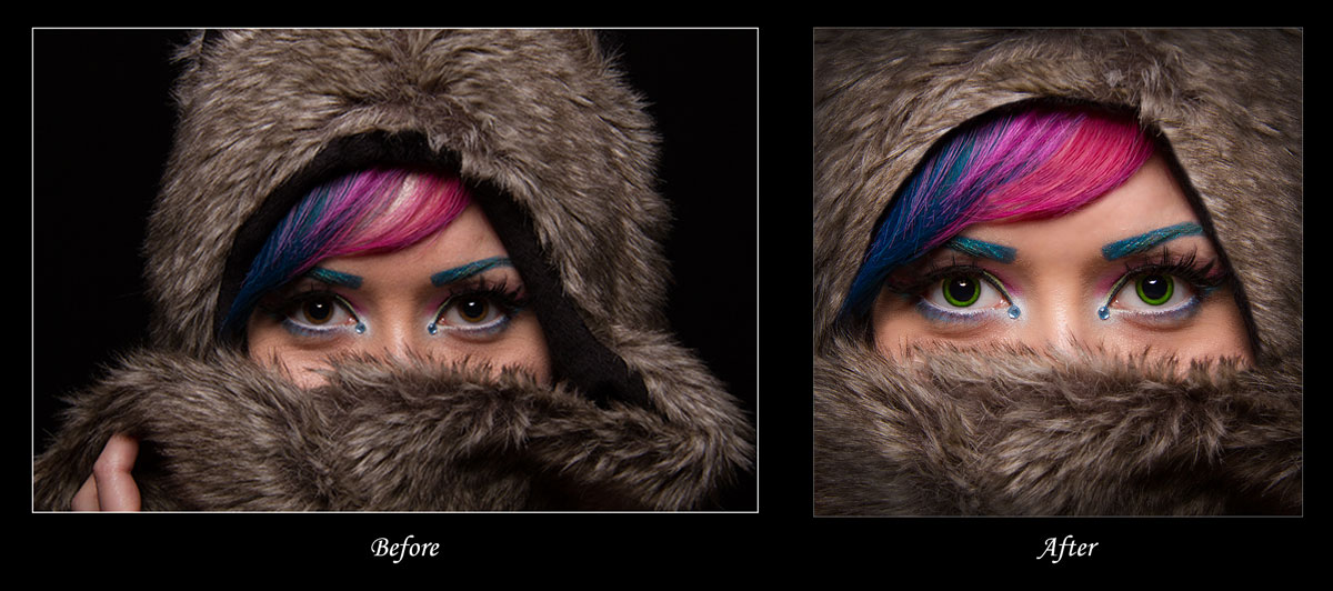
- Forum-Competition-Before-&-After.jpg (137.05 KiB) Viewed 15219 times
Re: 198 January Comp 2018
Posted: Thu Jan 11, 2018 11:18 pm
by melbarnes
The image in the top right hand corner ("AFTER") is a composite which I called "First Class Male". It was made from four separate images (the "BEFORE"):
- A stone wall and road, taken in Billinge (and I haven't saved this image for some reason - so apologies for that)
- A mail box, taken at Haworth Railway Station
- The background - taken in the Peak District
- A bull, taken in the grounds of Cambridge College - again, I haven't saved the original image, but here is the cut out that I made)
The shadow under the bull's chin was put in via Photoshop.
Re: 198 January Comp 2018
Posted: Fri Jan 12, 2018 3:17 pm
by mikeaspinall
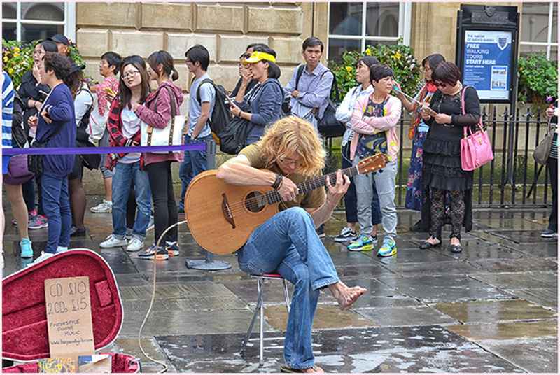
- GUITARIST BEFORE.jpg (291.98 KiB) Viewed 15192 times
- THE GUITARIST FINAL.jpg (135.99 KiB) Viewed 15192 times
Re: 198 January Comp 2018
Posted: Mon Jan 15, 2018 10:43 pm
by al c field
HERE IS MINE
Re: 198 January Comp 2018
Posted: Tue Jan 16, 2018 4:24 pm
by John
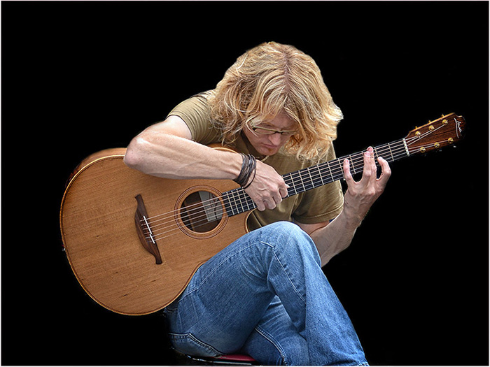
- 022 Church of St John.jpg (432.35 KiB) Viewed 15123 times
Churches are notoriously difficult to capture, lack of space usually leads to converging verticals (left) and although this is actually correct our eyes prefer correction (right). This can be done using tilt and shift lenses, or alternatively, as here, using Photoshop. The image was shot on film for English Heritage's Images of England project.
Re: 198 January Comp 2018
Posted: Wed Jan 17, 2018 12:09 pm
by johcha
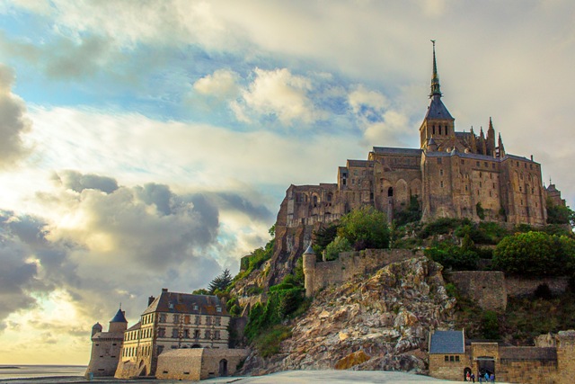
- RAW file of Mont St Michel in France. This was the best (!) shot I had, hand held, from a distance and early evening.
- 048aa - Copy.jpg (91.66 KiB) Viewed 15092 times
Re: 198 January Comp 2018
Posted: Wed Jan 17, 2018 12:11 pm
by johcha
The comments on St Michel should be the other way round!! Cheers
Re: 198 January Comp 2018
Posted: Wed Jan 17, 2018 9:28 pm
by JOJO
Re: 198 January Comp 2018
Posted: Thu Jan 18, 2018 12:43 am
by Janice Freeman
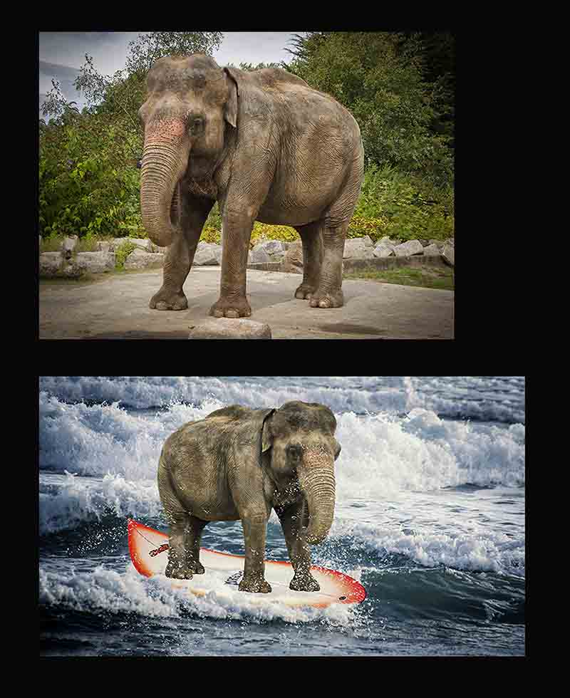
- Water skiing.jpg (91.1 KiB) Viewed 15054 times
Re: 198 January Comp 2018
Posted: Thu Jan 18, 2018 4:23 pm
by Phil Jones
Hi Everyone.
This was the most painstaking Photoshopping I've done so far so I was really pleased that no one seems to have noticed!
Regards,
Phil.
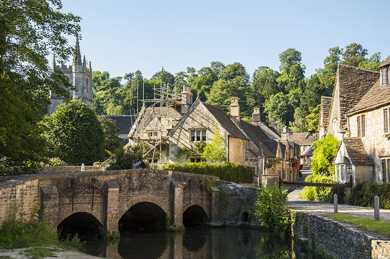
- Castle Combe As Shot.jpg (212.52 KiB) Viewed 15038 times
Re: 198 January Comp 2018
Posted: Sat Jan 20, 2018 9:36 pm
by Gordon Armstrong
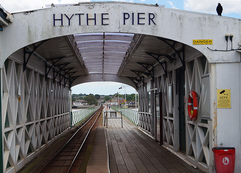
- forum Hythe pier original.jpg (251.9 KiB) Viewed 14990 times
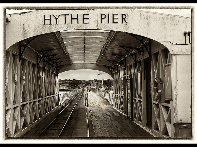
- forum Hythe pier mono.jpg (275.51 KiB) Viewed 14990 times
Hythe pier in Hampshire. Original cropped and basic levels adjusted. Remove bird and modern signs. Remove railings mid way after judges comments. Convert to mono in Nik with antique filter.
Re: 198 January Comp 2018
Posted: Mon Jan 22, 2018 8:27 pm
by stopher002
Evening All
Sorry for the delay, work commitments.
1. Tracey - I love it. The attention to the finer detail, firstly the crop, changing colour to the eyes, infilling of the hair line & the fur. Would I have gone the same way YES, maybe just lifted the shadows under the eyes a tad.
2. Mel - Well composed, Having the thought to put several images together, not something I do and envy the people who have that creativity. The image works well, but the lighting is off slightly making it look like it needs more work. Still take my hat off to you, this technique is something I can't do.
3. Mike - I remember this image in one of the comps we had, liked it then. Cutting out the background was the way to go, but with that said it makes it look more of a studio shot & that's were the lighting is off. No fall off of light from one side to the other. Still a great image.
4. Alistair - Great effort, not quite sharp enough. The changes I can see is a little exposure lighting. maybe a tighter crop would have helped.
5. John R - Great explanation on how to correct the image, however I see a lot of bits in the sky that could have been cleaned up.
6. Johcha - What a transformation, love the subject matter. Again attention to detail, removing the van & bird, blue's not over done, tonal range in the image is pleasing to the eye, do you remove the people in the bottom RHS (me yes) to make it a cleaner image.
7. JoJo - Here we are again more than one image, shows creative mind, wish I had this talent. But the contrast with the two images is off a tad, also there seems to be a halo of light under the brick arch (sky)
8. Janice - Of the composites I like this the most, the others were put together as a believable place. This said don't be silly Elephants can't surf, laugh along with me. Humour & a well put together image, maybe tone down the lighting on the board & elephant & its there.
9. Phil - Well another talent, removing all that scaffold to get your image, bet the builder wasn't happy with you Phil. Photoshop? or did you go back several days later, no i think not. Lot of work involved doing this, more patience than me. You saw what could be accomplished while you were there, foresight love it.
10. Gordon - Sepia was the way to go. Removing the modern signage (detail again) pulling it back to yesteryear.
And we had double figures for this comp, great
Now for the bit I hate the most, choosing a winner above everybody else's hard work.
Here goes
3rd Place - Janice Talent & humour
2nd Place - Johcha If Tracey had not entered, this was my winner, was just pipped at the post
1st Place - Tracey For me this hit all the points. Finished comp image, attention to detail, cropping is probably one of the best tools to gain
the perspective to draw you in.
Looking forward for Comp 199
Re: 198 January Comp 2018
Posted: Wed Jan 24, 2018 1:06 am
by Janice Freeman
Well done Tracey. Once again some great entries and different talents on show. I really enjoy the processing side of images, whether it be straightforward or creative. Some good useful comments. Glad you enjoyed the humour in mine. Lovely to see a decent number of entries.
As always, looking forward to the next challenge.

Re: 198 January Comp 2018
Posted: Sat Feb 03, 2018 6:38 pm
by Tracey McGovern
Sorry, I didn't realise I had won this, I haven't logged on for a couple of weeks. I'll get my thinking cap on.