Page 1 of 2

Competition #9 - Portraits

Posted: Sun Feb 10, 2008 5:19 pm
by Paul Jones
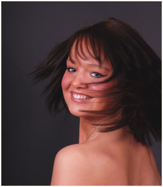
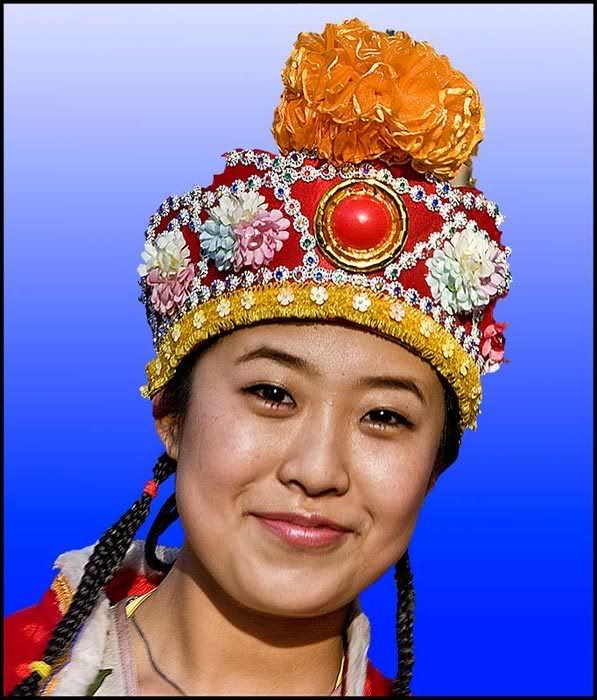
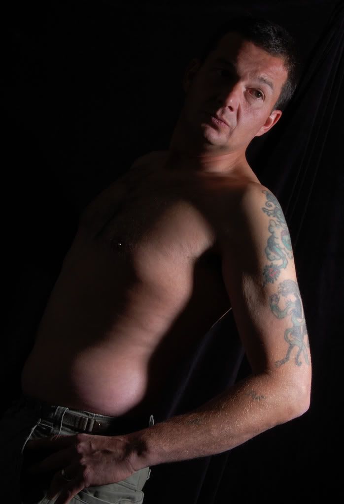
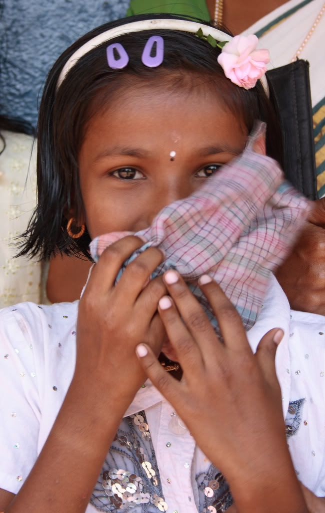
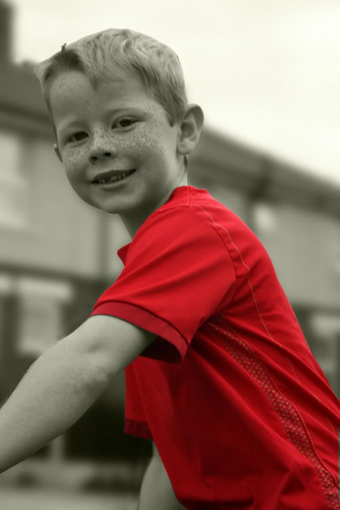
The theme for this competition is 'Portraits', or more loosely 'People'.

I'll use the ADAPS definition of a portrait:

"A likeness of a real person or persons. This could include more than one person, provided they are the main subject of the image. Environmental portraits (in their surroundings) can be used. Candid portraits could also be included in this category. Photographs of large groups or animals or pets will not be considered."

You may post ONE photograph per person, so choose a shot that you think will grab my attention. It may be a posed studio shot, a candid shot taken outdoors, a spur-of-the-moment snap, someone at work, a street scene, whatever...

As before, the competition will run for two weeks. The closing date is midnight on Sunday 24th February.

I will select the winner and he/she will then choose the theme for the next competition.

Good luck

Re: Competition #9 - Portraits

Posted: Sun Feb 10, 2008 7:34 pm
by sunsworth
Ok, I'll start.

Waving Joss Sticks in Manchester's Chinatown this afternoon.

Image

Re: Competition #9 - Portraits

Posted: Sun Feb 10, 2008 10:40 pm
by Myra
Image

Re: Competition #9 - Portraits

Posted: Sun Feb 10, 2008 11:37 pm
by John
Self Portrait

Image

Re: Competition #9 - Portraits

Posted: Mon Feb 11, 2008 12:38 pm
by Tom Gerrard
Anna Yuk Keu Yip at the Chinese New Year (Year of The Rat) festivities in Manchester.

Image

Re: Competition #9 - Portraits

Posted: Tue Feb 12, 2008 7:02 pm
by bert haddock
Image
AMIR KHAN

Re: Competition #9 - Portraits

Posted: Wed Feb 20, 2008 8:37 pm
by pammie
Image

Re: Competition #9 - Portraits

Posted: Thu Feb 21, 2008 10:13 am
by kezzalou
Image

urban girl

Re: Competition #9 - Portraits

Posted: Thu Feb 21, 2008 5:53 pm
by Tracey McGovern
Little Shy Girl

Image

Re: Competition #9 - Portraits

Posted: Thu Feb 21, 2008 6:54 pm
by keith richardson
Self Portrait...
Well I thought that I am not going to use this anywhere else, so I may as well share it with you.
And why not .... :-d :evil:

Keith.

Image

Re: Competition #9 - Portraits

Posted: Thu Feb 21, 2008 11:35 pm
by Sue
Is That A Pentax?

Image

Re: Competition #9 - Portraits

Posted: Fri Feb 22, 2008 7:32 pm
by Des
Kelly
Image

Re: Competition #9 - Portraits

Posted: Sun Feb 24, 2008 8:12 pm
by Andy C
SAM
Image

Re: Competition #9 - Portraits

Posted: Mon Feb 25, 2008 8:24 pm
by Paul Jones
Thank-you to everyone who entered. You gave me a difficult task. I've looked through them all several times.

My results are as follows...

Len - it's a nice idea. Reflections can be fun. The image may be tighter if you were to crop the pink furry distraction from the bottom edge.


Myra - I was there when you took this and I know what you were trying to achieve. It's close but it hasn't quite worked for me. I think it may have been a stronger image if she had been better placed in the frame. It's a difficult shot to get right and I think you did well.


Tom - a striking image. You've caught her expression well. My only nit-pick with this image was the blue, almost chromakey, background - which I'm guessing was added later. I would have preferred to see her in a more natural surrounding. I think the blue is too overpowering.


Pammie - the contrasty lighting suits him - you've done well with it. I don't think the 'fashion tilt' adds much to the image though. It's the kind of shot that might look stronger in black and white.


Tracey - I like it, but I think it's let down a little by the movement in the cloth she's holding. The background doesn't help the image, especially the hand on her left shoulder. It's not a bad attempt.


Keith - We're used to seeing strong images from you and this is no exception. It's inventive. I kept looking at it.


Sue - Everybody likes baby pics. You've captured a great expression.


Des - I thought we would have seen more studio shots in this competition. There's not much to fault you on this with regard to technique, but the thing that lets it down a little for me is Kelly's expression. To me, her smile looks forced rather than relaxed.


COMMENDED
John - Trust Mr Riley to come up with something out of the ordinary. :D Whether it can really be classed as a 'portrait' is open to question, but it's striking.


COMMENDED
Andy C - Sam's a likeable chap. You've captured him very well and have obviously thought about depth of field. This perhaps would have scored higher, but I'm not a fan of the 'selective colour' treatment you've used. I just can't see why you're placing so much emphasis on the red shirt. Selective colour can work well when used perhaps more selectively. Having said that, it's only my opinion.


3rd
Steve (sunsworth) - I don't think that Steve can take a bad picture. This one has bags of character and is backed up with your 'punchy' black and white treatment that leaps off the page.


2nd
Kerri (kezzalou) - Here, I think the 'fashion tilt' does work. I'd perhaps be tempted to tilt even more. The shot has some attitude and is a promising start. The glasses are a nice touch.


1st
Bert - I kept coming back to this one. It's not because of who he is. The direct flash is perhaps a little unforgiving, but on the whole I decided to choose this one as my winner. Well done.


I would now like to ask Bert to choose a theme for the next competition - with a usual two-week deadline. If you post your theme, Bert, one of the moderators will make it a 'sticky'.


Best regards

Re: Competition #9 - Portraits

Posted: Mon Feb 25, 2008 9:02 pm
by Myra
Well done to Bert, i love Amir, Des and i both follow his progress.

Myra :) :)